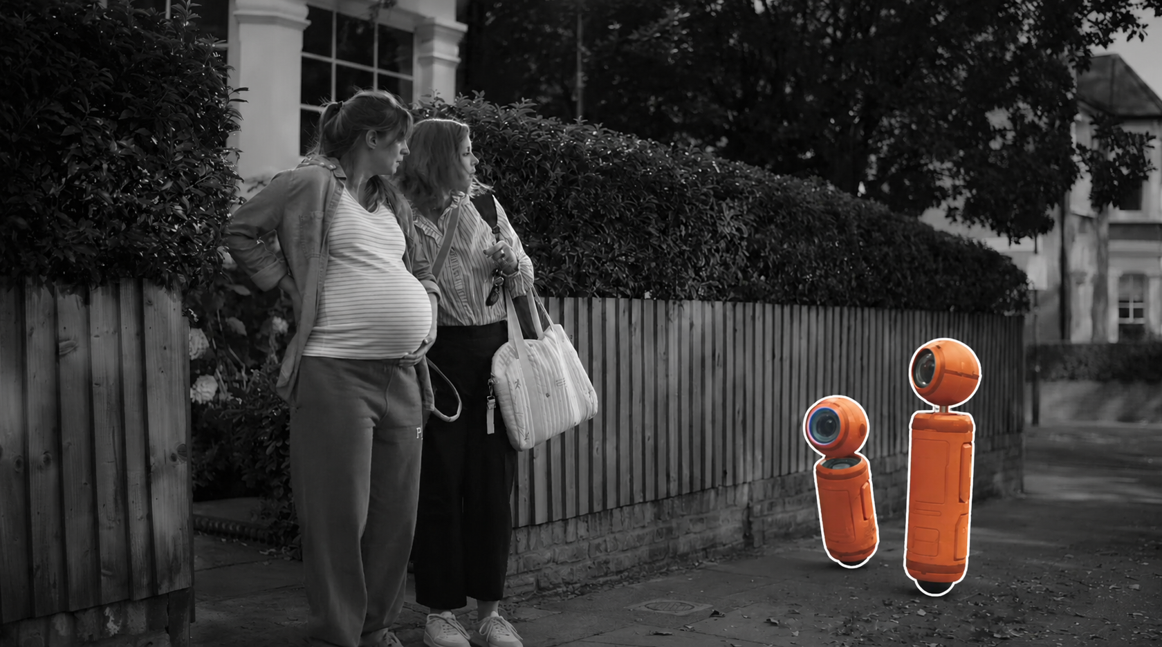
Silhouette
Before anything else, ask yourself one question: if you removed all the color and lighting from this frame, would your character still read?
A strong silhouette means the character's shape is immediately recognizable as a distinct outline against the background. No confusion, no merging with the environment, no guessing. The shape alone tells you what and where the subject is.
This is why character designers always test their designs in pure black silhouette. If the character reads there, it reads everywhere. In animation, silhouette works the same way. If your character's arm disappears into the background, the action disappears with it. A punch that does not read in silhouette does not read at all.
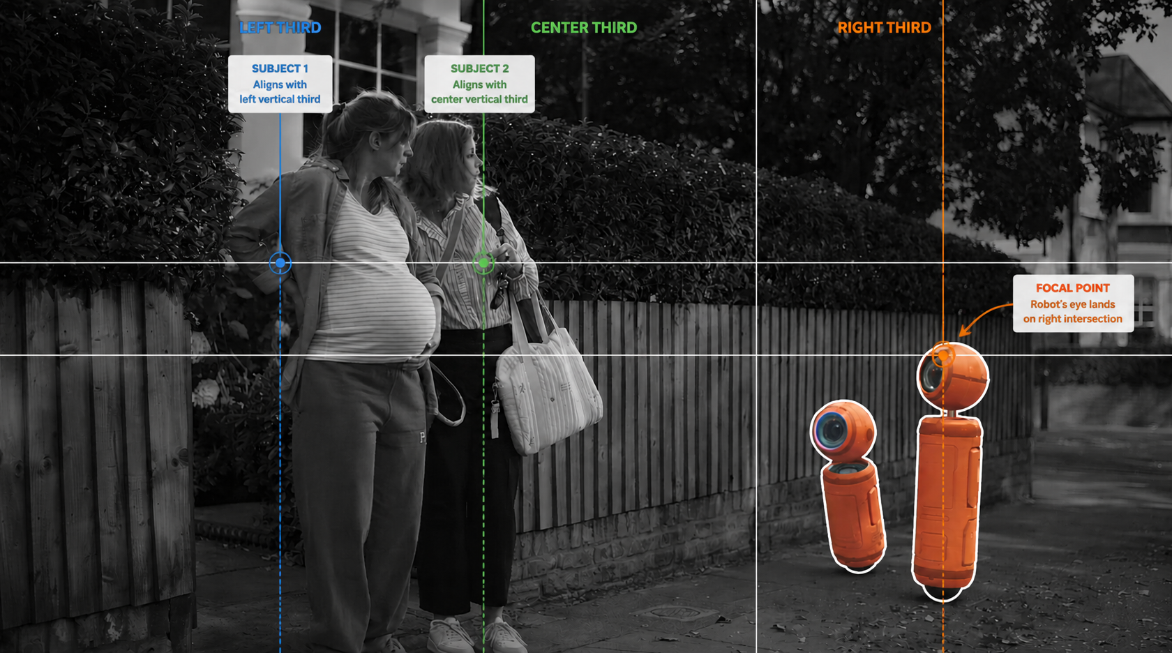
Rule of Thirds
Divide your frame into a grid of nine equal rectangles: three columns, three rows. The four points where those lines intersect are where the human eye naturally wants to rest. Put your subject there.
Centered compositions feel static. They work in specific contexts. confrontation, symmetry, formality. but for most animation shots they kill energy. Placing your character on a third intersection creates visual tension, gives the frame a sense of movement and intention, and makes the composition feel designed rather than accidental.
The same principle applies to the eyes. In a character close-up, the eye line should sit on the upper horizontal third. Not the center of the frame. The upper third. This is one of those rules that once you see it, you cannot unsee it.
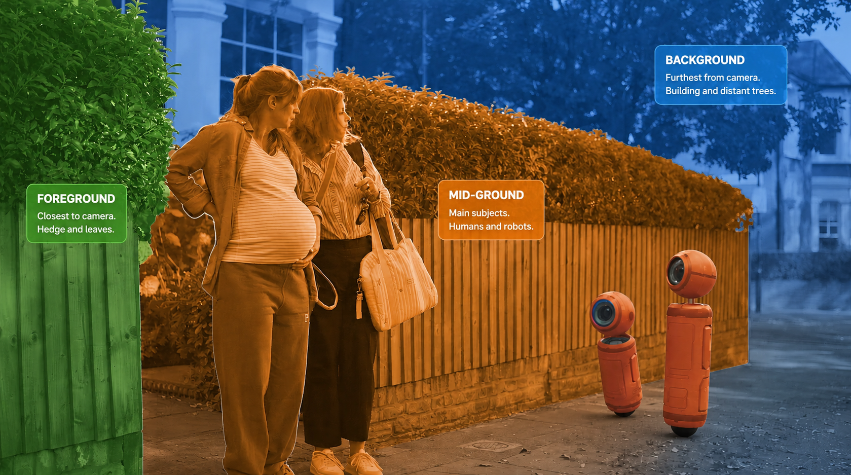
Depth and Layering
A frame without depth is a frame without space. When everything sits on the same plane, the world feels flat and the character has nowhere to exist.
Depth comes from layers. Foreground, mid-ground, background. At least three distinct planes that separate clearly from each other. The closer something is to the camera, the more it grounds the viewer in the space. The further something is, the more it creates atmosphere and context.
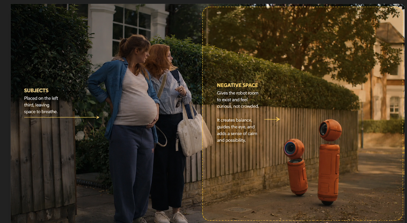
Negative Space
Negative space is the part of the frame that is not occupied by the subject. It is not empty space. It is breathing room.
When a character is surrounded on all sides by busy environment, the eye has nowhere to rest and the subject feels trapped. When there is deliberate space around the subject, the character has room to exist. The eye finds them immediately, stays with them, and has space to follow where they are going.
Line of Focus
Every frame has natural lines in it. The edge of a building. A road receding into the distance. A fence running across the background. A character's arm pointing in a direction.
These lines guide the eye. When they converge toward your subject, the composition is working with you. The viewer's attention is directed to exactly where you want it without them knowing it. Used well, it makes the subject feel inevitable. The eye arrives there naturally, without effort, because the entire frame is pointing the way.
Environment as Context
The last thing to consider is what the environment is saying about your subject. A character placed in a wide open landscape reads differently than the same character in a narrow corridor. The environment is not decoration. It is information. It tells the viewer where the character is, what kind of world they inhabit, and often what they are feeling.
In animation this matters even more than in live action because you are building every element deliberately. Nothing is in your shot by accident. The choice to include a specific piece of set, to position it at a certain distance, to light it in a certain way. all of it contributes to how the subject is perceived.